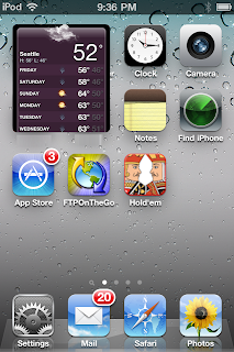
 In that space, the app runs and show its information. This 2x2 one is 266x294 pixels on the iPhone 4 (or 133x147 on non-retina iPhones). Purely shrinking down the weather app's screen to fit, it works. Designed properly with a bigger font and such would look awesome.
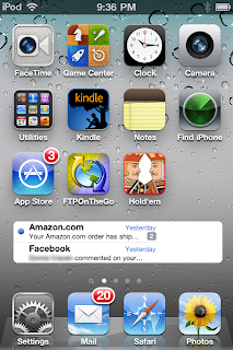
 A wider 4x1 size, perfect for showing the most recent email messages.
 Two 4x2 sized ones would fill a screen--email on top, Facebook or Twitter below.
In edit mode (wiggling icons) those that allowed could be resized by dragging an indicator in the lower right corner. Simply drag the widget's corner to be as tall or short as you want. And a normal (X) in the upper left corner to delete.
Tap to activate (a glow effect around the border & fade the rest--like when you open a folder/group?), then allow scrolling and interacting with the widget-app. Tap outside to return to normal.
Some would be interactive, tap the Music one (that shows the album artwork as it's default!) and there would be pause/play, next & previous buttons.
Some might just open the app--like Notes would show the most recent note's text, but tapping opens the Notes app.
We'll find out on the 6th how close this might be.