Purely as a user and not developer, there are some bits of the App Store app that suck.
The biggest problems are the Updates and Purchased sections. I admit I do have a bunch of apps in the iTunes account, so there are 500+ apps. But really 500 is nothing--gmail instantly tells me I have 75,174 emails archived.
I timed it: on a new iPhone 5, on my fast WiFi network at home, tapping the "Purchased" item it sits working with the little spinner going for 37 seconds before showing the list. Many times I've thought it had crashed or simply given up. Way, way too long.
The Updates isn't quite as bad, it loads within a few seconds, but still not as quickly sometimes. But if I go and tap "Update" on a few things, it becomes slower and slower to respond. After 5 or so taps, it seems a second or more between my tap and when it shows it recognized it. After a few it gets unusable so I don't ever update more than a couple at a time.
Apple, you can do better.
Monday, December 31, 2012
Wednesday, December 19, 2012
Idea to App: BounceBash
I've been adding to this post as the game was developed...
The initial idea came from reading about the "remake Pong for the 20th anniversary" competition. I had an image of dribbling the ball along a curving ground. We never submitted the idea for the competition, the rewards didn't seem to be worth it. I didn't want to submit and get 6th or something, so not win anything but Atari has the rights to the idea! And eventually seeing the winners, ours would have been pretty far out there.
I created the XCode project Feb 10, 2012. "SpringPong" was the initial placeholder name.
We immediately decided it needed more than dribbling, and it became a mashup of Pong for bouncing, Tiny Wings for the curving ground, and Angry Birds for smashing stuff.
It started by using ground Shawn had drawn for a yet-to-be completed game, and he did the smiling ball too. The initial theme was going to be "video game themed" and be inspired by all sorts of games thru history.
Funny that the initial placeholder ground is exactly the same as what we used in the final product. (Though not this slightly textured version--the even plainer variation.)
.PNG)
The very first versions had basic little buildings, but we soon switched to the random stacks of blocks since there could be much more variety.
.PNG)
Shawn did a few other things in this batch, and I did the minesweeper ones.
.PNG)
Lots of Physics (thank you Box2d) so the boxes fell and bounced realistically.
.PNG)
There's a big section about this time I missed taking screenshots while we tried many things that didn't survive long.
A number of versions had you releasing balls from cages. We tried having them be copies of the original ball, but that got too busy--after a few balls were active, everything got smashed barely onto the screen, and it was very easy to keep at least one of the balls going.
We did so the balls that were released had a powerup, like exploding any blocks they hit, and those colored balls shrank away after a 10 seconds or so. That got very busy too, and really didn't have a main character. No screenshots, but a video!
We also tried something like paddle-ball with an elastic rope connecting the paddle to the ball. It looked weird, and you'd expect the rope to hit the buildings. This didn't even last an afternoon :)
.PNG)
I asked both my wife and niece what sort of animal would be bouncing along, and they both said an Armadillo. I had an idea for a balled up armadillo character, and did this quick sketch to send to Shawn. He then made it look much better :)
.PNG)
With the Dillo armadillo character, and trying sections with a ceiling.
.PNG)
Pete said something like "It's a great technology demo, but it has to be a game." Figuring out the Game part took a long time.
Dillo Dreams. We worked quite a long time with this as the theme. Very meta, Dillo is dreaming he's the star of a video game. We'd done three pretty complete themes: iWorld, Jeweled, and Old School.
.PNG)
You'd break the boxes to release stars, and catch them with the paddle. Breaking the boxes with a big star on it now released a big power-up star you could catch with the paddle and activate the power-up on Dillo. You could pick colors for the helmet and that gave extra time for the power-up of that color.
.PNG)
Everything stacked up very precariously, so any tap would send the boxes falling.
.PNG)
.PNG)
For a long time you just bounced along faster and faster, but at high speeds it was hard to see things collapse--you'd be past before they hit the ground. We added some "pauses" where it slowed down if Dillo was bouncing back toward the paddle, to give more time to see and smash stuff.
You'd get more power-ups available the farther you went in one game. With some end-game bonus things so you'd restart at chapter 2 or 3 to let you get a bit farther in later games.
A ceiling, getting extra meta video-game-in-a-video-game with the iPhone status as the ceiling. We liked it, but hadn't really figured a good use; going in a cave or something was the best idea for how to drop the ceiling and have you bounce off that too.
.PNG)
.PNG)
.PNG)
We showed it to some people at Chillingo as part of looking to see if we should work with a publisher....and they didn't like it. Really they were 100% right with the comments, so we owe them a huge thanks. It's going to be a better game because of them.
It was too easy, and the difficulty didn't ramp up well. It was hard to aim and you could have bad luck with blocks getting in the way right in front of the paddle. A good player and a bad player would get similar scores on the same section; there wasn't a level of player expertise beyond not missing.
And they didn't really like the armadillo character and video gamey theme.
So we talked a lot and started making changes. One was the theme, to add more drama, he'd be fleeing a tornado in the desert. (This was a first step on making sandstone type towers that would have a continuous texture between pieces that could break apart. Cool, but scrapped since it would be hard to do that and make it look drawn like the rest.)
We tried and rejected some sort of swipe control to aim and shoot him.
.PNG)
Similar using quick sandstone colored blocks (it also shows the spinner towers we had for a long time.)
One big hangup with this desert theme was we never could think of what would explain the paddle. Bouncing off a bed? Tumbleweed? Something else?
.PNG)
Somehow you'd have to keep ahead of the tornado--a bit we didn't ever figure out before changing.
Between August and November 2012, we worked quite a lot and had some totally new ideas that took the game in a very different direction. The resulting game is still in being completed and hopefully will come out sometime early in 2013. I'll post this section of the progress once the other game is released!
Then... Not so much back to the drawing board, as another drawing board :)
.PNG)
.PNG)
A bug, but a funny one so I took a screenshot. The paddle could keep increasing in size if you got the Big Paddle star several times :)
.PNG)
Better status and score things. Pete pushed for the powers to have a time limit, makes catching new ones and changing up the game important (rather than keeping the one big power you have.)
.PNG)
.PNG)
.PNG)
The blocks still can get in the way of the ball a bit, but not nearly as much with the much slower pauses at the towers.
And we just got rid of the floating blocks that got in the way even more (see way back above, crates supported by a balloon.)
.PNG)
.PNG)
Simple menu, but lets you see your current powers, and makes PLAY the big obvious choice.
.PNG)
He loved the gameplay but didn't like the stark white graphics, so we went full circle and tried putting in the Armadillo again :) There were a lot of tries. For a few days it was the stark black/white graphics until you got a powerup, then the whole world changed to be in color and have the Dillo character.
In the end we went with black and white versions of the nice drawn graphics, with those changing to color as you got a powerup. It helps show "we do have nice graphics, it's a style choice to be black and white" even at the beginning when you haven't seen a powerup yet!
.PNG)
There were a few new things needed, but mostly we got to use all the things we'd done before, Sweet! Shawn drew a few new things for the ground for different powerups, like the Moonscape and the very last one to get done was the awesome Earthquake ground.

.PNG)

.PNG)
It was fun thinking up all the crazy powerups. Lots of testing to get them nice and destructive (increasing the number of lightning bolts, and adjusting the number of shots from the laser.)
We did keep the plain black/white, but as a "1980" powerup you can get from the rainbow star. So it's still there, but as a funny random power and not the main UI of the game. We're already pretty sure that if this does well (fingers crossed!) that we'll do that version of the graphics as an unlock-able theme for the game so you can play that version :)
.PNG)
.PNG)
.PNG)
We went back to the old ping-pong paddle as the main one. Thinking if we say "bounce with the paddle" it's as obvious as we can make it what you use to bounce with.
Pete said: why not put back the cannon to get him started? Sure! Makes as much sense as bouncing an armadillo with a ping-pong paddle :) (Or bouncing him with a flying saucer on the moon.)
.PNG)
We really did get to use nearly everything. The old gem theme from the Dillo Dreams days, plus a new gem ground and paddle that Pete made work perfectly for the highest triple-stars and triple-points powers.
.PNG)
I spent a long time working on the help and tutorials. This is I think the 3rd version of what you'd get from the HELP button on the main menu. Little bits of animation, and lots of small tweaks to the wording as I showed people at the Seattle NSCoder Night group. "Slide and Bounce" changed to "Slide On The Left And Bounce" and also added the finger on the left.
.PNG)
.PNG)
With the "Video" which is an automated gameplay script; and some slow-motion bits of text with pointers the first time you play (I think that was Pete's suggestion again); there's really 3 different how-to-play things. I hope it helps anybody get started. (Including a nice touch: if you miss really early, it triggers to show the first-game-slow-motion help again. Assuming it might be some new person trying the game who didn't know what to do so missed very early in the game.)
We tested and changed gameplay things right up to the end. Until the last few days, breaking blocks was what increased the multiplier. Only about 3 days before we were done did Pete suggest some change to catching the stars (since they didn't do much but unlock some powers.) Pete's ideas would have been harder to do as we were trying to get done by Friday so I tried that catching the stars that increased the multiplier--an easier change to program :) (Eventually we expect they will be used as currency to unlock themes or stuff--but increasing the bonus multiplier gives a reason to catch them right now too.)
Pete made the great icon and splash screen, as well as the trailer video.

And after all that, months of work and changes and testing, we submitted it December 7, 2012. We all clinked drinks against the Skype window on our computers for a toast.
(August 9, 2012...)
The initial idea came from reading about the "remake Pong for the 20th anniversary" competition. I had an image of dribbling the ball along a curving ground. We never submitted the idea for the competition, the rewards didn't seem to be worth it. I didn't want to submit and get 6th or something, so not win anything but Atari has the rights to the idea! And eventually seeing the winners, ours would have been pretty far out there.
I created the XCode project Feb 10, 2012. "SpringPong" was the initial placeholder name.
We immediately decided it needed more than dribbling, and it became a mashup of Pong for bouncing, Tiny Wings for the curving ground, and Angry Birds for smashing stuff.
It started by using ground Shawn had drawn for a yet-to-be completed game, and he did the smiling ball too. The initial theme was going to be "video game themed" and be inspired by all sorts of games thru history.
Funny that the initial placeholder ground is exactly the same as what we used in the final product. (Though not this slightly textured version--the even plainer variation.)
.PNG)
The very first versions had basic little buildings, but we soon switched to the random stacks of blocks since there could be much more variety.
.PNG)
Shawn did a few other things in this batch, and I did the minesweeper ones.
.PNG)
Lots of Physics (thank you Box2d) so the boxes fell and bounced realistically.
.PNG)
There's a big section about this time I missed taking screenshots while we tried many things that didn't survive long.
A number of versions had you releasing balls from cages. We tried having them be copies of the original ball, but that got too busy--after a few balls were active, everything got smashed barely onto the screen, and it was very easy to keep at least one of the balls going.
We did so the balls that were released had a powerup, like exploding any blocks they hit, and those colored balls shrank away after a 10 seconds or so. That got very busy too, and really didn't have a main character. No screenshots, but a video!
We also tried something like paddle-ball with an elastic rope connecting the paddle to the ball. It looked weird, and you'd expect the rope to hit the buildings. This didn't even last an afternoon :)
.PNG)
I asked both my wife and niece what sort of animal would be bouncing along, and they both said an Armadillo. I had an idea for a balled up armadillo character, and did this quick sketch to send to Shawn. He then made it look much better :)
.PNG)
With the Dillo armadillo character, and trying sections with a ceiling.
.PNG)
Pete said something like "It's a great technology demo, but it has to be a game." Figuring out the Game part took a long time.
Dillo Dreams. We worked quite a long time with this as the theme. Very meta, Dillo is dreaming he's the star of a video game. We'd done three pretty complete themes: iWorld, Jeweled, and Old School.
.PNG)
Thankfully the cat played it, so there's some video...
You'd break the boxes to release stars, and catch them with the paddle. Breaking the boxes with a big star on it now released a big power-up star you could catch with the paddle and activate the power-up on Dillo. You could pick colors for the helmet and that gave extra time for the power-up of that color.
.PNG)
Everything stacked up very precariously, so any tap would send the boxes falling.
.PNG)
.PNG)
For a long time you just bounced along faster and faster, but at high speeds it was hard to see things collapse--you'd be past before they hit the ground. We added some "pauses" where it slowed down if Dillo was bouncing back toward the paddle, to give more time to see and smash stuff.
You'd get more power-ups available the farther you went in one game. With some end-game bonus things so you'd restart at chapter 2 or 3 to let you get a bit farther in later games.
A ceiling, getting extra meta video-game-in-a-video-game with the iPhone status as the ceiling. We liked it, but hadn't really figured a good use; going in a cave or something was the best idea for how to drop the ceiling and have you bounce off that too.
.PNG)
We'd done a menu for selecting the theme and to get to the costume design where you could pick your helmet and cape. (Using stars you had collected as the currency.)
.PNG)
.PNG)
We showed it to some people at Chillingo as part of looking to see if we should work with a publisher....and they didn't like it. Really they were 100% right with the comments, so we owe them a huge thanks. It's going to be a better game because of them.
It was too easy, and the difficulty didn't ramp up well. It was hard to aim and you could have bad luck with blocks getting in the way right in front of the paddle. A good player and a bad player would get similar scores on the same section; there wasn't a level of player expertise beyond not missing.
And they didn't really like the armadillo character and video gamey theme.
So we talked a lot and started making changes. One was the theme, to add more drama, he'd be fleeing a tornado in the desert. (This was a first step on making sandstone type towers that would have a continuous texture between pieces that could break apart. Cool, but scrapped since it would be hard to do that and make it look drawn like the rest.)
We tried and rejected some sort of swipe control to aim and shoot him.
.PNG)
Similar using quick sandstone colored blocks (it also shows the spinner towers we had for a long time.)
One big hangup with this desert theme was we never could think of what would explain the paddle. Bouncing off a bed? Tumbleweed? Something else?
.PNG)
Somehow you'd have to keep ahead of the tornado--a bit we didn't ever figure out before changing.
REDACTED
Between August and November 2012, we worked quite a lot and had some totally new ideas that took the game in a very different direction. The resulting game is still in being completed and hopefully will come out sometime early in 2013. I'll post this section of the progress once the other game is released!
/REDACTED
(November 12)
Then... Not so much back to the drawing board, as another drawing board :)
I wondered about doing both versions of the game, since we had so much of this game working too, so spent a bit of time revisiting the old ideas. And in the end, they're very different. People who have played both hardly even recognize that they're related.
We thought to do it very simply because we'd always liked the stark "70s" theme from the Armadillo game. And, honestly, we though we could just whip it out faster that way and get some people playing it! Do the best looking retro graphics we could do with modern effects. So simple white shapes, but cool effects and the cracks Shawn drew for when they're breaking help make it something better that just a box :) Don't bother making a story, just bounce and smash stuff ("Bounce and Smash" was one of the titles at this time too.)
.PNG)
We made a few changes, and figured out solutions to a few of the gameplay holes on this 2nd time around.
Now, you get one power at a time, and the whole game background and ball and paddle color changes to be that power's color. (Before, you could have several at once and sparkles behind the ball helped show which ones--but could have a lot of colored sparkles!)
The other major solution we figured out was for "aimless bouncing". Because of the curving ground, the ball can just get bouncing up and down, or be too high and passing over the piles of blocks. A simple gameplay solution: a new tap action to call the ball to the paddle. So much easier than some technical fix we might never have found. And lets you as the player do cool back-side aiming to hit on the far side of towers, or retry to line up a shot on a block you want to hit.
And that recall-ball also helps for letting good players do much better than beginners. By the time we were submitting, Shawn would consistently set scores twice as high as I could--a good sign that expertise matters :)
And that recall-ball also helps for letting good players do much better than beginners. By the time we were submitting, Shawn would consistently set scores twice as high as I could--a good sign that expertise matters :)
.PNG)
A bug, but a funny one so I took a screenshot. The paddle could keep increasing in size if you got the Big Paddle star several times :)
.PNG)
Better status and score things. Pete pushed for the powers to have a time limit, makes catching new ones and changing up the game important (rather than keeping the one big power you have.)
.PNG)
We thought up lots of fun and silly things for the random rainbow star. And in our constant re-use of things, the "Laser" is part of cannon muzzle flash Shawn had done for the Armadillo game. I stretched out a part of it to make a beam, and voila! Laser!
.PNG)
Some of the better particle effects, nice outlines to go along with the outlined look of the paddle and ball. This has the new thermometer graphic for the bonus multiplier, and better buttons for pause and recall too.
.PNG)
The blocks still can get in the way of the ball a bit, but not nearly as much with the much slower pauses at the towers.
And we just got rid of the floating blocks that got in the way even more (see way back above, crates supported by a balloon.)
.PNG)
Rather than having all the powers (since it quickly got overwhelming when we were even testing) we decided to limit to 4, and a nice power selector to let you pick any of them to mix and match. Adds nice re-playability, to try different combinations as you get new powers. Bullet Blast was the last power, there was a blank hole in the grid for a long time.
Adding lots of crazy things for the Random star is where the bullets started, and they turned out so cool it made sense to include them as the final destructive power you unlock.
.PNG)
Simple menu, but lets you see your current powers, and makes PLAY the big obvious choice.
.PNG)
We had trouble figuring out the name, finally coming up with BounceBash. We'd always wanted Bounce in the name if we could, since that is the best one-word description of the gameplay :) Bash had the nice alliteration, fits under an icon, and has the nice double-meaning of "hit" and "party".
(December 10...)
We contacted Beatscribe who did some great music for the game, and most of the sound effects too.He loved the gameplay but didn't like the stark white graphics, so we went full circle and tried putting in the Armadillo again :) There were a lot of tries. For a few days it was the stark black/white graphics until you got a powerup, then the whole world changed to be in color and have the Dillo character.
In the end we went with black and white versions of the nice drawn graphics, with those changing to color as you got a powerup. It helps show "we do have nice graphics, it's a style choice to be black and white" even at the beginning when you haven't seen a powerup yet!
.PNG)
There were a few new things needed, but mostly we got to use all the things we'd done before, Sweet! Shawn drew a few new things for the ground for different powerups, like the Moonscape and the very last one to get done was the awesome Earthquake ground.

.PNG)
Shawn drew smiles and grins for expressions on the guy, there's even a space helmet he wears on the moon! Pete used them to make the awesome icon with the "crazy-smile" grin.

The main menu needed to be a bit cooler after the change from "starkness", so added the game terrain constantly scrolling past. There's an invisible thing behind the Y that starts everything moving and falling. It shows before you even begin a game that 1) we have nice graphics 2) things are going to fall and smash which is cool.
.PNG)
It was fun thinking up all the crazy powerups. Lots of testing to get them nice and destructive (increasing the number of lightning bolts, and adjusting the number of shots from the laser.)
We did keep the plain black/white, but as a "1980" powerup you can get from the rainbow star. So it's still there, but as a funny random power and not the main UI of the game. We're already pretty sure that if this does well (fingers crossed!) that we'll do that version of the graphics as an unlock-able theme for the game so you can play that version :)
.PNG)
.PNG)
.PNG)
We went back to the old ping-pong paddle as the main one. Thinking if we say "bounce with the paddle" it's as obvious as we can make it what you use to bounce with.
Pete said: why not put back the cannon to get him started? Sure! Makes as much sense as bouncing an armadillo with a ping-pong paddle :) (Or bouncing him with a flying saucer on the moon.)
.PNG)
We really did get to use nearly everything. The old gem theme from the Dillo Dreams days, plus a new gem ground and paddle that Pete made work perfectly for the highest triple-stars and triple-points powers.
.PNG)
I spent a long time working on the help and tutorials. This is I think the 3rd version of what you'd get from the HELP button on the main menu. Little bits of animation, and lots of small tweaks to the wording as I showed people at the Seattle NSCoder Night group. "Slide and Bounce" changed to "Slide On The Left And Bounce" and also added the finger on the left.
.PNG)
WHEN to use the recall wasn't as obvious in early help pages and confused testers. This is a good change to the text and animation that came from the NSCoder meetings. It animates a tap and him flying backward thru the blocks--as you can see in the final game.
.PNG)
With the "Video" which is an automated gameplay script; and some slow-motion bits of text with pointers the first time you play (I think that was Pete's suggestion again); there's really 3 different how-to-play things. I hope it helps anybody get started. (Including a nice touch: if you miss really early, it triggers to show the first-game-slow-motion help again. Assuming it might be some new person trying the game who didn't know what to do so missed very early in the game.)
We tested and changed gameplay things right up to the end. Until the last few days, breaking blocks was what increased the multiplier. Only about 3 days before we were done did Pete suggest some change to catching the stars (since they didn't do much but unlock some powers.) Pete's ideas would have been harder to do as we were trying to get done by Friday so I tried that catching the stars that increased the multiplier--an easier change to program :) (Eventually we expect they will be used as currency to unlock themes or stuff--but increasing the bonus multiplier gives a reason to catch them right now too.)
Pete made the great icon and splash screen, as well as the trailer video.

And after all that, months of work and changes and testing, we submitted it December 7, 2012. We all clinked drinks against the Skype window on our computers for a toast.
Sunday, December 16, 2012
Mike's Rules of CSI Guilt
These rules apply to CSI and most other crime shows.
1) The biggest guest star, who isn't also a possible love interest of a regular character is guilty.
2) A doctor or lawyer who isn't there as part of their profession as a doctor or lawyer (business partner, friend, parent, etc.) is guilty.
3) The first, most obvious person interviewed is innocent. (Though they are often guilty of something else.)
...more to come...
Friday, December 7, 2012
BounceBash
Yeah! Just submitted BounceBash to Apple. Hopefully it makes it out by Christmas. Fingers crossed.

Thursday, December 6, 2012
Apple Television
I'm pretty sure I've now purchased more iPhones and iPads than I've bought computers in my lifetime. Definitely that's true for in the past 10 years of purchases.
But my main TV is now over 10 years old. It is a nice big projection HDTV that was expensive but not crazy at the time I bought it; only now are flat panel ones getting big enough and cheap enough to think about replacing it someday.
The screen on any recent TV will do fine for many years, just as mine has done. It would be incredibly wasteful and silly to upgrade them the way we upgrade phones every few years. If I buy an Apple Television, I'll want it to last 10+ years like the last one.
But what if Apple sold so the screen had a detachable and upgradeable CPU/memory/logic box. The "Screen" part that really was only the display, and that separate box that slid into a socket that had all the CPU and memory. They likely could do it so the box was size of an AppleTV now.
Then in a couple years when you can get a new logic box (for something like built-in LTE for watching Internet TV truly without a cable, and who knows what other cool stuff) you'd just pop out the old module and plug in a new one and that's it.
It's even a good business model: sell TV now for $X99, sell upgraded CPU every 2 years for $99. Seems better than other model: sell TV now for $X99, hope it breaks then sell another TV when it does.
Friday, November 30, 2012
Icon Test Page
Like every iOS developer, we need to test lots of icons. And while looking at them in a dropbox folder or sending by email works, nothing is as good as seeing them for real on an iPhone or iPad.
My brother (who does all the icons) is in London while I'm in Seattle--so he often is working on them while I'm sleeping. We figured out a cool way so he can test them easily.
We made a PHP script that looks for icon files in a folder on the server. It then makes up a web page to see them all on an iPhone default background, styled close to how they really look.
.PNG)
.PNG)
In the morning, Shawn and I often have a whole page to look at as Pete has narrowed things down and tried variations. Above is the progression for an icon for BounceBash (update, now in the App Store).
But even better, if you tap one, it sets that icon as the "apple-touch-icon" for the page so if you save the page to your home screen, you get that icon on the springboard.
.PNG)
And it works for any number at all, so you can add lots of test icons. The "newest" even auto-updates if you tap it on the springboard, then return.
.PNG)
Pete did lots of nice HTML5 things for curves and stuff, so you will only need to provide your own background image. And you'll need to edit the .php file to add a path so it knows where to look for the icon images.
My brother (who does all the icons) is in London while I'm in Seattle--so he often is working on them while I'm sleeping. We figured out a cool way so he can test them easily.
We made a PHP script that looks for icon files in a folder on the server. It then makes up a web page to see them all on an iPhone default background, styled close to how they really look.
.PNG)
The script detects if it's an iPad to look right there as well.
.PNG)
In the morning, Shawn and I often have a whole page to look at as Pete has narrowed things down and tried variations. Above is the progression for an icon for BounceBash (update, now in the App Store).
But even better, if you tap one, it sets that icon as the "apple-touch-icon" for the page so if you save the page to your home screen, you get that icon on the springboard.
.PNG)
And it works for any number at all, so you can add lots of test icons. The "newest" even auto-updates if you tap it on the springboard, then return.
.PNG)
And here is what you need.
Download This. It has both the index.php and .css files needed to put this on your server and make it work!Pete did lots of nice HTML5 things for curves and stuff, so you will only need to provide your own background image. And you'll need to edit the .php file to add a path so it knows where to look for the icon images.
Monday, November 12, 2012
iPad mini 2
I've had the iPad mini for a couple weeks now.
I've done a lot of testing of our upcoming games on it*, watched a few videos, played other games (Angry Birds Star Wars among others), and the usual browsing and facebooking.
I still love it. It is the best portable game-playing device I've ever had. The extra size screen makes things much easier to see than on the iPhone, and the size fits my hands much better than the full size iPad.
* That's another story :)
Saturday, November 3, 2012
iPad mini
Is quite amazingly thing and light. So much more portable feeling. If I didn't have a big iPad with LTE already, I'd probably return and upgrade the mini. But as often as we're really out-and-about without WiFi; the big iPad 3, or the iPhone, can do the WiFi hotspot sharing.
I wonder if this had been the first iPad, and now there was a larger, thicker, heaver 9.7 inch model being released, how the response would have been.
I wonder if this had been the first iPad, and now there was a larger, thicker, heaver 9.7 inch model being released, how the response would have been.
Thursday, November 1, 2012
Oh, Microsoft.
I was going to install Windows 8, not intending to write anything about the process, just let it work away while I did other things, but...
The 2nd question asked, after the language to use, was for the license key. OK. But the directions for where to find the key don't match your packaging. It's not on the back of the box--it's on a little card inside the box. Not a big deal, but really shouldn't have something immediately wrong with the directions.
.JPG) I wanted to do a new install (booting off a DVD). So did the Advanced option. It then presented me with a nice big list of "Drive 0 Partition 1" "Drive 0 Partition 2", 10 choices in all with the couple disks that are in separate partitions and I think some USB disks. But nowhere does it say which one is the C: drive or which is the J: drive or anything helpful to tell them apart! I'll have to go back out rebooting into Windows and look at the free disk space & size to figure which drive/partition is the one I want.
I wanted to do a new install (booting off a DVD). So did the Advanced option. It then presented me with a nice big list of "Drive 0 Partition 1" "Drive 0 Partition 2", 10 choices in all with the couple disks that are in separate partitions and I think some USB disks. But nowhere does it say which one is the C: drive or which is the J: drive or anything helpful to tell them apart! I'll have to go back out rebooting into Windows and look at the free disk space & size to figure which drive/partition is the one I want.
.JPG) And to top it off, that screen doesn't even have a BACK button? No wait, there it is, not by the Next button but in the upper left in the window's titlebar where 100% of the time I've used Windows for the past 20 years has been something else. Is it my fault I missed it for awhile? [Having finished the upgrade as I add this bit, it's not even a new thing for the rest of Windows to have the back button there--just the installer does it. Weird.]
And to top it off, that screen doesn't even have a BACK button? No wait, there it is, not by the Next button but in the upper left in the window's titlebar where 100% of the time I've used Windows for the past 20 years has been something else. Is it my fault I missed it for awhile? [Having finished the upgrade as I add this bit, it's not even a new thing for the rest of Windows to have the back button there--just the installer does it. Weird.]
.JPG) Now I can go back and at least click the other option. I booted off the DVD, so can't do that. OK. But your message has block things in the text that say "I'm using some old font that doesn't have “quote” characters in it." Trivial to fix by just using old straight " characters. Nobody noticed this?
Now I can go back and at least click the other option. I booted off the DVD, so can't do that. OK. But your message has block things in the text that say "I'm using some old font that doesn't have “quote” characters in it." Trivial to fix by just using old straight " characters. Nobody noticed this?
.JPG) I had installed the Windows 8 preview before, hmm, which one in the boot menu is the new Windows 8 and which is the old? I managed to guess right! (The old broken Windows XP Setup choice there I've not managed to get rid of is another story.)
I had installed the Windows 8 preview before, hmm, which one in the boot menu is the new Windows 8 and which is the old? I managed to guess right! (The old broken Windows XP Setup choice there I've not managed to get rid of is another story.)
I had read that there was a new tutorial during the install process, to help people get started with all the changes. "Good Idea" I'd said. But: the tutorial is one page of animation, saying to move the mouse into any corner. That's it? No mention about what the different corners do, or any more than that?
It started the new Metro* UI, and I promptly moved my mouse to the upper left corner--which did nothing. Same for lower left. Oh, right corners do the charms. Using a bit more, ah-ha, after I've started an app, then upper left will let me switch (but I can't move my mouse into the corner, then back out onto the thumbnail to click it. Gotta click right in that corner. Why show the thumbnail that big but only make a fraction clickable?) Huh, either left corner, then straight up or down does the switcher.
Since they are not even close to the same, saying "move the mouse to any corner" is hardly enough. Wouldn't it have been useful to make that tutorial explain what each corner did? Or explain the extra motions after moving into the corner on the left side? Or explain anything else about the new actions? You could have simply made a Metro tile for "watch a tutorial video" that covered stuff to help people get started. I know I can lock one Metro app on one part of the screen, but I'll have to go playing around to figure that out.
In our FTP app (and it's an FTP client, so it's for pretty knowledgeable users) the very first thing it does is offer to play a tutorial video.
WTF Microsoft.
* And fuck your marketing and stupid "Windows 8 Style UI" naming, I'm calling it Metro.
The 2nd question asked, after the language to use, was for the license key. OK. But the directions for where to find the key don't match your packaging. It's not on the back of the box--it's on a little card inside the box. Not a big deal, but really shouldn't have something immediately wrong with the directions.
.JPG)
.JPG)
.JPG)
.JPG) I had installed the Windows 8 preview before, hmm, which one in the boot menu is the new Windows 8 and which is the old? I managed to guess right! (The old broken Windows XP Setup choice there I've not managed to get rid of is another story.)
I had installed the Windows 8 preview before, hmm, which one in the boot menu is the new Windows 8 and which is the old? I managed to guess right! (The old broken Windows XP Setup choice there I've not managed to get rid of is another story.)I had read that there was a new tutorial during the install process, to help people get started with all the changes. "Good Idea" I'd said. But: the tutorial is one page of animation, saying to move the mouse into any corner. That's it? No mention about what the different corners do, or any more than that?
It started the new Metro* UI, and I promptly moved my mouse to the upper left corner--which did nothing. Same for lower left. Oh, right corners do the charms. Using a bit more, ah-ha, after I've started an app, then upper left will let me switch (but I can't move my mouse into the corner, then back out onto the thumbnail to click it. Gotta click right in that corner. Why show the thumbnail that big but only make a fraction clickable?) Huh, either left corner, then straight up or down does the switcher.
Since they are not even close to the same, saying "move the mouse to any corner" is hardly enough. Wouldn't it have been useful to make that tutorial explain what each corner did? Or explain the extra motions after moving into the corner on the left side? Or explain anything else about the new actions? You could have simply made a Metro tile for "watch a tutorial video" that covered stuff to help people get started. I know I can lock one Metro app on one part of the screen, but I'll have to go playing around to figure that out.
In our FTP app (and it's an FTP client, so it's for pretty knowledgeable users) the very first thing it does is offer to play a tutorial video.
WTF Microsoft.
* And fuck your marketing and stupid "Windows 8 Style UI" naming, I'm calling it Metro.
Tuesday, October 23, 2012
iPad update thoughts...
I suppose Apple is sending a message, "we're not going to compete in the race-to-the-bottom for tablet prices." But still I expected them $30 less. $299 seems much more than $30 different than $329. And I'd still have given them $30 more for the smart cover anyway :)
I think we'll be able to skip the iPad 4 in our test-device suite. Anything that runs on the iPad 3 will just run much better on the iPad 4.
Now that "new iPad" name this spring makes perfect sense. I bet they knew this spring they'd update the iPad again in the fall--and didn't want iPad 3 out for only 6 months before iPad 4 came out.
Damn close.
http://michael.burford.net/2012/08/througherer.html
My prediction of 300 grams was damn close to the 308 for the WiFi model and 312 for Cellular. Nice to be right on these Apple predictions :)
My prediction of 300 grams was damn close to the 308 for the WiFi model and 312 for Cellular. Nice to be right on these Apple predictions :)
Thursday, October 11, 2012
So Siri...
It's cool that Siri now can be asked about new things. I'll use Movies, but probably never use Sports.
But it didn't need to be part of an OS update to do that. It's like if you had to upgrade your browser in order to search for new things on Google. Siri is all on the server, your phone sends off some compressed voice stuff, and the server figures out what question you asked and sends back the answer (hopefully).
The response could and should have all the formatting things (a little web-page document so all the formatting is done that way seems easy.)
It's good Apple is improving Siri. But if they keep doing so there's a big set of new improvements each year when the new iOS version comes out--rather than just continually adding new things you can ask about throughout the year--that will be very disappointing and a missed opportunity.
Monday, October 8, 2012
Materials
The iPhone 4 and 4S always felt like a solid chunk of glass. The iPhone 5 with that extra lightness feels like a solid chunk of Oak or something of that density. That might be part of the "niceness"--its density feels more like something natural.
Apple keeps making them thinner. But at some point they'll get to a thickness and not be able to go farther. More for working with a human a hand than materials. Something as thin as a knife blade would be uncomfortable if not a dangerous thinness. And far before that it gets thin enough it would be difficult to pick up off a flat surface. That may be the deciding factor for just how thin a future iPhone could be; a pickup-from-a-desk test.
And from holding mine, I'd say that's about 1/2 the thickness of the current iPhone 5.
(And flexible displays only would work if they can become rigid after unfolding. Can you imagine typing on a display that bent and warped or folded with every touch?)
Sunday, October 7, 2012
Saturday, October 6, 2012
iPad & Christmas
More rumors. I always thought the timing of Apple's iPad releases was closer to Christmas than I would do. The March timeframe is close enough to Christmas that I'm sure there are people who both wait to get one knowing a new model is coming, or others that feel a bit bad that their 3 month old present is now last years model.
There are pluses of doing it early in the year: All manufacturing difficulties have long been worked out by the time Christmas arrives many months later. And it's given Apple something pretty huge to announce in the spring.
But I wouldn't be surprised if this year was different. The biggest reason this year woud be to get all their devices updated to the Lightning plug before this year's Christmas. That may even be the only change to the iPad 3--a new plug.
Using a version of the new chip that is in the iPhone 5 may let them get the iPad 3 back to the thinness of the iPad 2. I just don't think if they did that now that they'd have any big changes to do next spring, and if they shift the iPad refresh time to the fall, that is both good and bad..
Monday, October 1, 2012
If the iPhone 5 was a Movie
Apple sold 5 million iPhones the first weekend.
Assuming that the three models averaged out to a ticket price of $749, (that's the price of the unlocked 32GB model, which should be close to what Apple gets from the cell phone carriers too.) That would be $3.7 billion for the opening weekend of "iPhone 5: the Movie"*.
According to Wikipedia, and adding up the numbers, the top 10 worldwide opening movies since 2002** combined would be about the same $3.7 billion. Nice.
* Though I kinda hope they'd name it "iPhone V: 4 Inches of Retina". #iphone5themovie
** I doubt any older movies would be in that particular not-adjusted-for-inflation list.
Sunday, September 30, 2012
How to Improve Map Data
I did bug fixes and used an in-house developed mapping system long ago--in Fortran on a VAX, so yeah, my experience isn't the most current...
I would assume it is also sending updated "I'm here" information to the server as needed for recalculating routes, etc. And that data can also be used to help improve the maps.
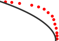 Assuming the road data you have is like the black line, but all the location data from people traveling on the road is the red dots--the servers can start to identify a difference. (They would get some sort of speed with the dots too, so you could tell the data was from something moving at the speed of a car rather than a row of houses).
If I was doing it, the servers could detect that sort of discrepancy and add it to a list to be reviewed by a person. Though maybe the server could update automatically too. (Automatic updates would be a question for all the ex-Google maps people that Apple is hiring :)
But to do that you need data. That's what Apple didn't have before, and was even giving that data to Google. But now they've got 100 million people providing that sort of information to them.
Commercials
AD 1:
I saw one of the Samsung ads, apparently trying to poke fun at people waiting in line for the iPhone 5.
A guy was enjoying his Galaxy phone, and was holding the spot in line for his parents.
But he didn't try to sell them on his Galaxy phone, or say anything was wrong about their choice of an iPhone. This implies that while the guy likes his phone, he must be agreeing that an iPhone is a better for his parents.
AD 2:
And the other commercial I saw was for the Droid phone. I think an earlier ad, prominently pushing that it does turn-by-turn navigation while the iPhone didn't.
Google wasn't ever going to give that Android advantage away to Apple. Maybe Apple could have spent a huge fortune for it from Google if Google would even agree to that for any amount of money. But then who knows what next mapping advantage Google would have held out to keep a plus for Android. Google had Apple at a huge disadvantage over maps.
It's a bit painful for some people today, but I'm sure Apple's maps are already improving. The map app itself isn't the problem, it's the data. Data on servers that Apple can easily update and fix.
It'll be interesting to see if iOS 7 changes so Bing is the default search engine.
Wednesday, September 26, 2012
The Mob Doctor
I think this is the first post about TV...and probably more interesting because it's about why I didn't like a show rather than what I do like :)
My wife likes medical shows, and I lean more towards gangsters, so "The Mob Doctor" seemed like something we both might like. But we only made it about 1/2 way thru the first episode before giving up.
There were some big problems.
1) Wrong network. Gangsters ordering people killed should not be limited to saying "Heck". The show should have been on cable so there could be profanity and violence suitable for the premise.
2) They really started the show at the wrong point in the character's lives. She was already working for the mob, and quite soon got a message to kill a patient. It seemed more like what would be season 2 or at least the middle/end of season 1. It skipped past all the interesting story about how a nice doctor got sucked into working for the mob.
The process of the character going from good, making poor choices trying to help family, to bad would have been a much better start to a series. Ending the season with a cliffhanger "Will she follow the mobster's order and kill the patient" or having that end the season so you wonder how far it'll go next year seems better than having it in the first episode. (I'll never know, we gave up before finding out if she did or not.)
Boardwalk Empire spent whole 2 seasons taking their characters to nearly the point.
3) Because of that jumping ahead in the big story, it felt they were introducing a huge number of characters all at once. Overwhelming and confusing.
Tuesday, September 25, 2012
Windowed
Reading this, I think he's very right, especially about Windows 8.
The part about the iPad mini might be correct too, we'll need to test and might need to adjust some apps. But if developers have followed the guidelines for touch sizes, things should still work quite well with no changes.
The article is much more correct about Windows 8 and tablets/desktop. The iPad mini would have a 2" change in size vs the 20" difference between a tablet and a desktop. I can already say from just using the previews a little that most Metro (Windows 8 Style-UI*) apps look huge and silly on my desktop, where the same app on a smaller-size-screen tablet would look far better.
Windows has gotten away with all sorts of screen resolutions and sizes by being Windowed. This is the download window for GetRight 1.0 from over 15 years ago. On some monitors it was bigger than others, but its one size worked on them all. In the years since, the graphics have gotten better, but the window size changed very little. And it worked on every install of Windows--the first versions even worked on Windows 3.1.

Yes, some Windows and Mac programs can go fullscreen, but the program has the choice. If it doesn't fit that way, it can be disabled easily by the developer. (I'd only ever used developer tools with lots of lines of text at fullscreen size. I've never used any program on my Mac in fullscreen mode.)
Imagine a calculator app that must fill the whole screen. On a phone it'll be perfect. On a tablet, it could be made to look good and fit nicely--but then imagine that same app blown up on a desktop. It would be totally silly.
Same for a clock app; Apple finally did one for the iPad in iOS 6, but some of the things look a little silly even at that size. The tiny little minute selector in the middle of the screen for the Timer for example. Now again, imagine that blown up on a 27" desktop screen.
* Microsoft does such a good job picking cool sounding code names, but then runs them all thru some corporate filter. How XBox didn't become "Microsoft Windows Game Console Live" we'll never know.
The part about the iPad mini might be correct too, we'll need to test and might need to adjust some apps. But if developers have followed the guidelines for touch sizes, things should still work quite well with no changes.
The article is much more correct about Windows 8 and tablets/desktop. The iPad mini would have a 2" change in size vs the 20" difference between a tablet and a desktop. I can already say from just using the previews a little that most Metro (Windows 8 Style-UI*) apps look huge and silly on my desktop, where the same app on a smaller-size-screen tablet would look far better.
Windows has gotten away with all sorts of screen resolutions and sizes by being Windowed. This is the download window for GetRight 1.0 from over 15 years ago. On some monitors it was bigger than others, but its one size worked on them all. In the years since, the graphics have gotten better, but the window size changed very little. And it worked on every install of Windows--the first versions even worked on Windows 3.1.
Yes, some Windows and Mac programs can go fullscreen, but the program has the choice. If it doesn't fit that way, it can be disabled easily by the developer. (I'd only ever used developer tools with lots of lines of text at fullscreen size. I've never used any program on my Mac in fullscreen mode.)
Imagine a calculator app that must fill the whole screen. On a phone it'll be perfect. On a tablet, it could be made to look good and fit nicely--but then imagine that same app blown up on a desktop. It would be totally silly.
Same for a clock app; Apple finally did one for the iPad in iOS 6, but some of the things look a little silly even at that size. The tiny little minute selector in the middle of the screen for the Timer for example. Now again, imagine that blown up on a 27" desktop screen.
* Microsoft does such a good job picking cool sounding code names, but then runs them all thru some corporate filter. How XBox didn't become "Microsoft Windows Game Console Live" we'll never know.
Monday, September 24, 2012
iPhone 5S
Now that the iPhone 5 is out, it's time to start predicting what will be in next year's iPhone 5S.
- It'll look pretty much identical as has been the case with all the *S models.
- Camera may get a slight increase in MP, but really it's getting high enough, better sensors as usual though.
- Faster as always.
- Still no NFC. (Because I've never seen anywhere I could use NFC to buy things or do anything. Apple doesn't do "checklist" items just to do them, they wait to do them right.)
None of those are that huge, I'd guess the bigger thing will be increase in the capacity. 32/64/128GB sizes.
It'll be interesting to see when the speed/battery trade off starts to switch the other way. This year they went for doubling the speed while keeping the battery life the same. What if next year it is a minor speed increase, but doubles the battery life?
Sunday, September 23, 2012
Maps
Apple maps might not be as good as google's yet. (Though around Seattle they've looked perfect).
Google may be laughing now, but they'd be wise to remember that when the first iPhone came out, the list of things everyone said were missing was huge. Microsoft, Blackberry/RIM, Nokia all laughed at what it didn't do too.
Google may be laughing now, but they'd be wise to remember that when the first iPhone came out, the list of things everyone said were missing was huge. Microsoft, Blackberry/RIM, Nokia all laughed at what it didn't do too.
Thursday, September 20, 2012
iPad mini/air weights again
Now that the iPhone 5 details are public, I thought I'd redo the math for the weight-per-volume using those new numbers.
The iPad 3 is 25.7 cubic inches (in³) and a weight of 23 oz. For 0.89 oz/in³.
The iPad 2 is 23.6 in³ and a weight of 21.3 oz. For 0.90 oz/in³.
The new iPhone 5 is 3.38 in³ and a weight of 3.95 oz. That's a slightly higher 1.16 oz/in³.
Using the predicted iPad mini/air size in inches of 7.78 x 5.31 x 0.28 is 11.57 in³....
Using an iPad density gives a weight of 10.3 oz (292 grams) on the low end and an iPhone 5 density give 13.4 oz (380 grams) on the high end.
Even the higher number is less than the weight of the new 7" Kindle Fire HD (13.9 oz).
I'm still guessing closer to the iPad density and a bit over 10 oz. But even on the high end, its still less than the competition.
Thursday, September 13, 2012
iPhone ∞
Go look here. Look at the pictures of the Porsche 911 over the past 40+ years. The details change a bit, but you look at any one of them and you recognize it is a Porsche.
They slowly evolve and improve: more fuel efficient yet more powerful engines, better safety features, better/different finishes.
That's how the iPhone has been and surely will be far into the future. There will be little differences, curves here, angles there, glass vs metal, but the iPhone you'll buy in the future will have that same recognizable style compared to what we have now. You'll recognize any future iPhone as being an iPhone.
Nobody expects Porsche to come out with a completely redesigned and different looking new model every year.
iPhone 5
I'm excited to order mine tonight and get it. Bigger, faster, thinner, lighter. All sounds great. We've already been updating apps to take advantage of the extra screen height.
Thinking about 2 years from now (since the iPhone 5S will surely follow the pattern of updating the stuff inside but keeping the same shell.) I doubt they'd change the resolution again, 1136x640 will be it for quite awhile. But if the "bigger is better" keeps up, they might increase the pixel size. They could now up to a 4.35" screen and still be under the magic 300 dpi Retina number...
But really the Width is what's important, easy 1-handed typing on the keyboard.
Monday, September 10, 2012
Windows 8
I've only used the Windows 8 preview a bit. But from that short time, I think "Windows 8" will be in business books in the same chapter as "New Coke".
Thursday, August 16, 2012
Wow, traffic.
One link from DaringFireball and in less than a day this little blog has gotten more page views than it had gotten in the 5 years previous. Nice :)
Better plug
A new connector is coming too.
Apple would know what percent of iPhones/iPads are returned because some little wire in the current 30 pin connection inside the device gets bent and doesn't connect anymore.
If the new connector can go in either direction, then they could have 2 sets of connections (one for each side of the plug) in the iPhone or iPad. If one ever failed, there's a built-in backup and you'd never even know. The odds of both sides failing for the same pin mean whatever the return rate is now, if nothing else changed about how pins connect and bend, this design could cut it to 1/8th that.
Wednesday, August 15, 2012
Througherer
Going by this really good analysis...
But Apple's stuff is built more solidly than the Nexus: aluminum, steel, and glass rather than plastic.
Redoing Gruber's weight estimates by calculating the Grams per Cubic Millimeter, the iPod touch is 0.00215 g/mm³ and the iPhone 4S is 0.00223 g/mm³. Multiplying that by his estimated volume comes out with a weight between 416 and 432 grams if it had a similar weight-per-volume as an iPod touch or iPhone.
On this list, that puts it around the Kindle Fire.
Doing similar with the iPad 3, it's about 423,557 cubic mm. For 0.00154 g/mm³ (the iPad 2 gives a virtually identical number, which is another good confirmation on this weight-per-volume method.) Based on those two, it gives a potential weight of 298 grams.
I'd guess that just about 300 grams is a pretty safe estimate, and not far off from the Gruber's original 265 :)
(updated to show correct g/mm³ unit label.)
Monday, July 16, 2012
Jobs on iPad 7.85
There are many examples of Steve Jobs adamantly saying one thing, then several months or years later, Apple would do the opposite. (Like no Video iPods, I haven't gone looking for more, but there's this nice quote that covers them all pretty well.)
The trick is in the past, it was Steve Jobs himself who'd get up on stage and hold up the new device that months or years before he said Apple would never make. More often than not, they'd figured how to do that thing the right way, and it took time or technology to catch up to what they wanted to build. Competitors were likely the only ones that ever made a big deal about it when he was alive, because they believed him the first time.
Now, people are using his comments about 7" tablets several years ago to say Apple will never make one. If he was alive, I bet he'd hold up a nearly 8" tablet and say how great it was...smaller to be even more portable than an iPad, but big enough to be a joy to use.
The current iPad is great for everything for me except reading in bed. The far lighter Kindle is what I use for that. But if a new smaller iPad is also much lighter, I may just change my reading habits.
Tuesday, July 10, 2012
iPod Updates
It's from AppleInsider, so taking with a large dose of salt, but that "dedicated new iTunes service" bit in the article got me wondering. iPods are well overdue for some updates, and rather than just a bump in GB, maybe finally something bigger.
The Kindle from the beginning had a 3G cell connection (later becoming an option to make cheaper models.) But it was only used for downloading books.
What if the new nano, and maybe a new iPod touch, includes a similar "free" built-in 3G cell connection, but only for downloading music. "Get a new song, anywhere." That seems like a very Apple thing to do.
Much like the Kindle, there's no choices of carriers, Apple makes a deal with one. Even at the high rates I'm paying for a connection on my iPad it's not that expensive for them: 2GB for $30, say that's 1000 songs = $0.03 per song. At the highest available iPad account (10GB for $80) it's even less at $0.016 per song. I'm sure with some huge deal it would be far less than that, tiny fractions of a cent for the bandwidth per song.
Especially for the nano, it probably wouldn't be upgradeable to do anything else. Maybe you could upgrade the iPod touch's one to use as a data connection, much like the iPad.
Friday, July 6, 2012
More iPad 7.85" thoughts
More thinking on iPad 7
There's a report that compares current iPad 2 vs 3 build prices. For the lowest end WiFi model:
iPad 2 $245 to build, and iPad 3 $316 to build.
With Apple selling them at $399 and $499. So roughly 38% and 36% profit.
I've not found updated numbers, since it has to cost far less to make them as they go along. But the estimated costs to manufacture iPhones when they first went on sale.
iPhone 3GS, $178 (here, from 2009)
iPhone 4, $188 (here)
iPhone 4S, $188 (here) to $203 (here)
And those prices have to be higher than they are now, as they're years old in some cases. To make a 3GS it seems it would be down to well under $100 by now (by Moore's Law, given the time it could be close to $50 for the 3GS). That's presumably the screen parts they would be using in the first generation iPad mini.
If a 7.85" iPad with a 1024x768 screen cost between the price of an iPad 2 and iPhone 4S to build: I'll use the high iPhone price estimate and average to call it $220 to build. A bit lower 26% profit on that would make it sell for $299.
And the build cost could be far less without a retina screen, it could be between the 3GS price and iPad 2, which could get under $150 to manufacture, and could retail for $199 or $249. If that one had just 8GB, and the upgraded one for $249/$299 had 16GB (and higher margins) they would do 25% or more profit on them too.
And it could also be between the iPhone 4S and the iPad 3 and cost around $250 to manufacture--WITH a retina display (using the same screen panels as the iPhone 4/4S.)
It could even be a combination of them, $199 for one with 8GB and a non-retina screen (perfect for schools to get for students, books take less space than apps, movies, etc.) $299 for 16GB plus a retina screen. There would be less profit margin on some, but then they'd cover all price ranges, and not leave any openings for competing tablets at all.
iPhone 3GS?
To add to the pondering here, in 2009 according to reports at the time, it cost $178 to make the iPhone 3GS.
It has to be far cheaper to make them now. I'd guess it is well under $100. Going by Moore's law, halving the price twice given the 3 years would be under $50.
What if they start selling the 3GS without a contract, for pre-paid type phones. They might be able to sell it for $99 and still make a hefty profit. Update it so it works in China, and they might sell a billion of them.
Sunday, July 1, 2012
Surface & Nexus
I wonder about Microsoft's Surface tablet.
OS: The tablet OS is Windows 8. Which means it's tied to the update schedule for Windows…which is very slow compared to iOS and Android.
Windows Vista was about 7 months old when the first iPhone came out (November 2006 for Windows, June 2007 for iPhone.) Nearly 3 years after Vista came Windows 7. It will be over 3 years after Windows 7 before 8 is out. iOS is up to version 6 in the same timeframe. Android is up to 4.1 in the same timeframe. The massive inertia and slow development times of Windows may keep updates from coming fast enough to compete. Windows 8 might be good when you buy your new Surface tablet, but what if it's years before there's a major update to the software on it?
VENTS: If the Pro version of the tablet has a specially designed vent system, that means it's generating enough heat to need special venting. That's also an avenue in for dust or water, it may be more susceptible to small splashes or drops than the sealed iPad is. And who knows how you'd feel that heat as you hold the tablet.
COVER: The keyboard within the cover does look great. I hope Apple does their own version of that. Small touch points to power the keyboard when it's attached, so no separate battery? I'll buy one.
PCs: It also makes me wonder about Microsoft making a regular desktop or laptop computer. I've always used their Natural keyboards and mice, and like them better than anything else. Plus the XBox and Surface designs show they can make hardware.
Apple focuses on mainly the mid and high end…and makes a ton of profit off that. Microsoft could make "signature" high end laptops, probably using a lot of the design stuff they did for the Surface (vents on a laptop make sense!)
If Microsoft keeps licensing Windows to anyone, and I don't think there would be any legal problems for them to also make their own PCs.
Yes, Microsoft could piss off all the PC makers out there, but those PC makers have no other real choices. Linux/Unix? maybe, but hasn't taken off on the desktop even with 20 years of trying. ChromeOS? just getting in bed with Google. Android? same. WebOS? killed. "Windows" is why people buy a PC vs a Mac.
GOOGLE Q: And the Nexus Q thing that seems just a bad imitation of the AppleTV.
Except that Google now owns one of the biggest set-top-box manufacturers in Motorola. Why wouldn't they start to include it in those? That will get it into more homes than selling this extra little expensive thing.
Friday, June 8, 2012
iPhone 5
I'm really liking the design if this is it:
http://www.youtube.com/watch?v=8XY841RAY4Y
A very impressively machined and built piece of metal. The SIM cardholder fits so exactly, and all the little screws and bits inside really makes me think it's not a fake. Or if a "fake" it's some prototype from a short-list of possible designs built by Apple. I'm sure they build a variety of shapes and sizes to try.
But then we were all convinced last year's iPhone update would be wider and flatter.
http://gizmodo.com/5836936/picture-proof-that-the-iphone-5s-thinner-and-wider
Monday, June 4, 2012
Retina Macbooks
Should be awesome.
I use it less and less, but I do have a Boot Camp* installed copy of Windows 7. And that may be awful.
Windows running on one of them would be crazy small--it won't know about the super-small pixels. I know our Windows programs don't have 64x64 sized icons for toolbars on a retina display** :) Buttons will be minuscule, text will be unreadable; or you'll have to set to some 1/2 resolution setting so everything will instead be big and blocky. Either way, Mac OS will look great, and Windows will look like crap.
* It was months ago, but I remember some idiot saying that Apple using some puns was a sign they were going down since Steve Jobs passing. "Boot Camp" is an excellent example of puns being used in product names under Steve Jobs.
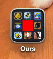
** Most of our Windows program toolbars are 24x24, like everybody else's. 24x24 is exactly the size of one of the tiny icons inside a folder on iOS on an retina screen.
Now the Macbook wouldn't be that high for Dots Per Inch, doing a little math: look at an iPhone screen, and imagine a toolbar button the size of the red square in the middle of this image. The icon plus some of the separator space--think you could click that with a mouse?
I use it less and less, but I do have a Boot Camp* installed copy of Windows 7. And that may be awful.
Windows running on one of them would be crazy small--it won't know about the super-small pixels. I know our Windows programs don't have 64x64 sized icons for toolbars on a retina display** :) Buttons will be minuscule, text will be unreadable; or you'll have to set to some 1/2 resolution setting so everything will instead be big and blocky. Either way, Mac OS will look great, and Windows will look like crap.
* It was months ago, but I remember some idiot saying that Apple using some puns was a sign they were going down since Steve Jobs passing. "Boot Camp" is an excellent example of puns being used in product names under Steve Jobs.
** Most of our Windows program toolbars are 24x24, like everybody else's. 24x24 is exactly the size of one of the tiny icons inside a folder on iOS on an retina screen.
Now the Macbook wouldn't be that high for Dots Per Inch, doing a little math: look at an iPhone screen, and imagine a toolbar button the size of the red square in the middle of this image. The icon plus some of the separator space--think you could click that with a mouse?
Subscribe to:
Posts (Atom)