I'm really liking the design if this is it:
http://www.youtube.com/watch?v=8XY841RAY4Y
A very impressively machined and built piece of metal. The SIM cardholder fits so exactly, and all the little screws and bits inside really makes me think it's not a fake. Or if a "fake" it's some prototype from a short-list of possible designs built by Apple. I'm sure they build a variety of shapes and sizes to try.
But then we were all convinced last year's iPhone update would be wider and flatter.
http://gizmodo.com/5836936/picture-proof-that-the-iphone-5s-thinner-and-wider
Friday, June 8, 2012
Monday, June 4, 2012
Retina Macbooks
Should be awesome.
I use it less and less, but I do have a Boot Camp* installed copy of Windows 7. And that may be awful.
Windows running on one of them would be crazy small--it won't know about the super-small pixels. I know our Windows programs don't have 64x64 sized icons for toolbars on a retina display** :) Buttons will be minuscule, text will be unreadable; or you'll have to set to some 1/2 resolution setting so everything will instead be big and blocky. Either way, Mac OS will look great, and Windows will look like crap.
* It was months ago, but I remember some idiot saying that Apple using some puns was a sign they were going down since Steve Jobs passing. "Boot Camp" is an excellent example of puns being used in product names under Steve Jobs.
** Most of our Windows program toolbars are 24x24, like everybody else's. 24x24 is exactly the size of one of the tiny icons inside a folder on iOS on an retina screen.
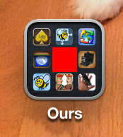
Now the Macbook wouldn't be that high for Dots Per Inch, doing a little math: look at an iPhone screen, and imagine a toolbar button the size of the red square in the middle of this image. The icon plus some of the separator space--think you could click that with a mouse?
I use it less and less, but I do have a Boot Camp* installed copy of Windows 7. And that may be awful.
Windows running on one of them would be crazy small--it won't know about the super-small pixels. I know our Windows programs don't have 64x64 sized icons for toolbars on a retina display** :) Buttons will be minuscule, text will be unreadable; or you'll have to set to some 1/2 resolution setting so everything will instead be big and blocky. Either way, Mac OS will look great, and Windows will look like crap.
* It was months ago, but I remember some idiot saying that Apple using some puns was a sign they were going down since Steve Jobs passing. "Boot Camp" is an excellent example of puns being used in product names under Steve Jobs.
** Most of our Windows program toolbars are 24x24, like everybody else's. 24x24 is exactly the size of one of the tiny icons inside a folder on iOS on an retina screen.
Now the Macbook wouldn't be that high for Dots Per Inch, doing a little math: look at an iPhone screen, and imagine a toolbar button the size of the red square in the middle of this image. The icon plus some of the separator space--think you could click that with a mouse?
Saturday, June 2, 2012
More WWDC Guesses
iCloud Time Machine for Mac. Much like the iCloud backup that's available for iOS, but for the Mac.
Apple could still be smart and media files like mp3, Mac App Store apps, the whole set of OS files, etc would be treated like they already are for iCloud syncing. Apple doesn't need a million copies, one for each person who downloaded a song, they need one copy linked to a million accounts. It's only each person's individual and unique files that would have to be stored--just as they already do with the iTunes Music Match for audio.
All as automatic as Time Machine, but instead of the backup being on a USB drive, it's all up in the cloud.
Friday, June 1, 2012
Interesting comparison of what's important
I've been working on the code highlighting and stuff for FTP On The Go and ViewSRC, and was using the code from various websites to test.
A fascinating comparison of what is important to different companies that you can do on your own computer: go to google.com, and right click the background of the page and pick the "View Page Source" or similar menu item. Everything squished down and unreadable by a person.

Same thing for facebook.com and many others.

Then try Apple.com.

I'm sure internally Google and the rest are all formatted for humans, but are stripped of returns and spaces when sent out to the world to save a few bytes of bandwidth. But Apple instead sends those few extra bytes, so for anybody who looks, even the code of their website looks beautiful. Now that's attention to detail.
Windows 8
I got the the new Windows 8 preview thing, and it's a huge departure from Windows. There will be a ton of relearning.
And there's a lot of stuff I don't really like, and things that makes it less user friendly. A small example:
Before, when the screen saver was on, you could tap the mouse to indicate "I'm going to use the computer". You'd be presented either right into your desktop, or to enter your password. Nice and easy. Unless you have a cat, that worked 100% of the time.
Now if you have a password set, after moving the mouse, you must then click/drag the new overlay lock image up and out of the way. And no, I can't start with the screensaver on with clicking and dragging up; it has to be 2 distinct actions--one to turn off the screensaver, another to hide the lock page. Adding a second or so for every time you want to use your computer. So I now have to do 2 actions to tell the computer I'm ready instead of 1.
And to make it more fun, while I saw it "bounce" once to show what's beneath, no amount of moving the mouse to a corner (which is a new standard "thing" for Windows8), or wiggling madly will give any hint about what to do next. Clicking isn't the craziest thing to try if you're guessing what to do; but unlike iOS, there's no obvious "Slide To Unlock" text hint about what to do.
I can see how the new unlock process makes perfect sense for a tablet that can be bumped around in a bag, but for a desktop or laptop it simply adds another step without any real benefit. That's the problem with Microsoft shoehorning everything into one OS. Stuff that makes perfect sense one a tablet doesn't work on a desktop. Pre-iPad, they'd gone the other way and focused on the desktop and let the tablet version try to adapt to those mouse/keyboard schemes. Which is why they never sold many tablets. Now they're doing things that make sense with touch on a tablet and adapting them to the desktop...we'll see how that works.
Steve Jobs famously pushed the first Mac OS developer(s) to shave seconds off the startup time. 1 second times a million people every day adds up. Microsoft is now doing the opposite, times 100 million people*.
*they hope. I have my doubts, I think many people will stick with Windows 7 the way people have stuck with XP.
Saturday, May 12, 2012
iOS 6 guesses
These are hopes and dreams for what Apple is building into iOS 6...
* Rich Text in the text editor. I want this for selfish reasons for FTP On The Go. We bought a color-editor, which works well, but one by Apple would work better.
* Allow discounts or upgrades in the App Store. I'd love to give a discount on FTP On The Go PRO for anybody who has bought the regular version. We'd probably give discounts on every app for owning another of ours.
* A system for handling all the resources in an app over the many devices. An iPhone 3GS doesn't need to download graphics that would only be used on a Retina iPad.
* User accounts of some sort. Only show all-ages games when doing a 0000 "niece borrowing my iPhone" unlock code, show everything when doing a different 1234 "me" unlock code.
Widgets:
1) If the notification center did pages swiping side to side, that would allow more stuff and more organization. Notifications on page one, widgets on the other pages.
 2) A much cooler idea, instead of the way I'd guessed last year, widgets could also be just like a regular icon on the home screen, and act something like Folders do when tapped to quickly show their information, and exit just like folders too. My chopped together example looks nice already.
I like it. Apple would need something different for displaying if a widget could also be within a folder. Newsstand is an example, it can't be in a folder (grr) and has custom UI for the widget layer. But I'd sure like to be able to put all those sorts of things in a folder; displaying how they nest deeper would be something for Apple to figure out.
If it's an icon when "minimized", then everything else for moving and deleting works as-is. Really wouldn't be any new learning curve for anybody using it, no new gestures or swipes to learn.
Dibs on the Flashlight widget!

* Rich Text in the text editor. I want this for selfish reasons for FTP On The Go. We bought a color-editor, which works well, but one by Apple would work better.
* Allow discounts or upgrades in the App Store. I'd love to give a discount on FTP On The Go PRO for anybody who has bought the regular version. We'd probably give discounts on every app for owning another of ours.
* A system for handling all the resources in an app over the many devices. An iPhone 3GS doesn't need to download graphics that would only be used on a Retina iPad.
* User accounts of some sort. Only show all-ages games when doing a 0000 "niece borrowing my iPhone" unlock code, show everything when doing a different 1234 "me" unlock code.
Widgets:
1) If the notification center did pages swiping side to side, that would allow more stuff and more organization. Notifications on page one, widgets on the other pages.

I like it. Apple would need something different for displaying if a widget could also be within a folder. Newsstand is an example, it can't be in a folder (grr) and has custom UI for the widget layer. But I'd sure like to be able to put all those sorts of things in a folder; displaying how they nest deeper would be something for Apple to figure out.
If it's an icon when "minimized", then everything else for moving and deleting works as-is. Really wouldn't be any new learning curve for anybody using it, no new gestures or swipes to learn.
Dibs on the Flashlight widget!
Tuesday, May 8, 2012
Pawn'd - Icon Evolution
I'm always interested in seeing the steps for how stuff got built...so another for Pawn'd. (earlier one here)

We bought the cool character set pretty early on, and Pete had done gems too by the time I made a real placeholder icon instead of a white box.
So even the first cut of programmer art turned out pretty good! I can resize and paste :)

Pete did all these pretty quick. Him in London and Shawn and I in the US means we often wake up with new graphics.


Still could be a little better when we put it into the app in the actual icon size. Things cut off...

The background gem texture is moved around so contrasting colors line up so he stands out much better.
I love it!
Subscribe to:
Posts (Atom)